Poverty Data: Where to Find It and What It Tells Us
With the recent recession and high unemployment rates, poverty seems to be a topic on everyone’s mind. Although poverty rates in the United States rose to 13.2 percent in 2008, Indiana’s rate was 12.9 percent, ranking Indiana 24th out of all 50 states and the District of Columbia. Compared to its neighboring states, Indiana has one of the lowest poverty rates. The most recent poverty data (2008) show some change in poverty over time, but it is not as large as might be expected given the state of the economy; however, the 2008 data are only indicative of the middle of the recession. While poverty levels differ by subgroup, this article focuses on all individuals in poverty.
Before poverty rates in Indiana and surrounding areas are described in detail, it is helpful to look at both how poverty is measured and what data sources are available.
How to Measure Poverty
This article focuses on absolute measures of poverty using data from several U.S. Census Bureau data sets. Using an absolute measure, if an individual or family falls below a specific line or threshold, they are considered in poverty. The income used for the poverty threshold is before taxes and includes money income from earnings, Social Security, public assistance, and other income types.1 It excludes noncash benefits like food stamps and capital gains and losses.
The threshold is adjusted based on the size of family and age of family members and is adjusted for inflation annually.2 For example, the 2009 poverty threshold for an individual under 65 is $11,161 and for a family of four with two children it is $21,756 (see Figure 1).
Figure 1: Selected Poverty Thresholds, 2009
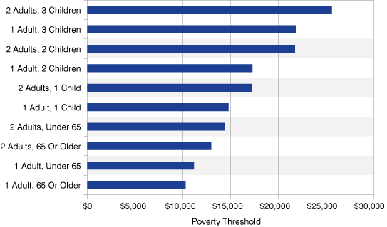
Source: IBRC, using U.S. Census Bureau data
Using a poverty threshold gives a clear and straightforward picture of the number of people in poverty and, depending on the data source, some demographic characteristics. However, there are some disadvantages to using the measure. The threshold is the same regardless of geographic location and doesn't account for higher cost of living in large urban areas, for example. Since the poverty line has not been adjusted since the 1960s, it may no longer accurately reflect what families spend to meet their basic needs. The poverty threshold does not take relative poverty (poverty relative to others) or depth of poverty (how far income is below the poverty line) into account.3 Depth of poverty is important because there is a considerable difference between someone who is a few dollars short of the poverty line and someone who is several hundred dollars short of the poverty line. There has been much scholarly debate over the measure of poverty, and alternative measures have been proposed. Although the Census Bureau will continue to use the current threshold, it is in the process of developing a supplemental poverty measurement that will be released in the fall of 2011.
Where to Find Poverty Data
The Census Bureau provides several sets of poverty and income data, depending on the method of collection. Each of those data sets vary depending on the method and users should decide which data set best suits a particular need. As a result, poverty estimates will differ depending on the data source used. The following list briefly describes the five different data sources and for which analyses they will be most useful.
-
Current Population Survey (CPS) annual social and economic supplement: Used for national poverty estimates and rates. It asks questions about income from more than 50 sources, and records additional information such as noncash benefits (school lunches, housing assistance, etc). The CPS annual supplement is useful for looking at the change in national poverty rates over time beginning in 1959 and at the state level since 1980. One disadvantage, especially for smaller states, is the relatively large sampling errors in the state-level estimates.
-
American Community Survey (ACS): Provides single-year national, state and subnational estimates for places, counties and metropolitan areas with a population of at least 65,000. Widespread collection of the ACS began in 2003. The ACS has mandatory response, like the decennial long-form census questionnaire that it replaced, so the sample size is large (about 3 million addresses), making ACS the best source for state-level data. There are also three-year estimates currently available for geographies with at least 20,000 people.4
-
Decennial census: Still the best measure of subnational and subpopulation change in poverty rates from 1990 to 2000, but since the 2010 census did not have a long-form component, current poverty data will come from the ACS instead.
-
Small Area Income and Poverty Estimates (SAIPE): This program is model-based and generates single-year poverty estimates for all states, counties and school districts. SAIPE provides the best subnational poverty estimates, especially if the population is under 65,000. SAIPE has a late release because it incorporates ACS data as well as other administrative data, but this causes the data to have smaller margins of error. Before 2005, CPS data were used to create the SAIPE models.5As a result of being a compilation of different data sources, SAIPE cannot provide detailed characteristics about the population in poverty.
-
Survey of Income and Program Participation (SIPP): Useful when looking at changes in poverty status for a particular family over a three- to four-year period.6
In summary, the CPS annual supplement is most useful for national poverty estimates, including detailed characteristics and year-to-year change. ACS is best for looking at state-level poverty rates, including detailed characteristics and year-to-year change. SAIPE provides information on poverty rates and year-to-year change for counties and school districts. We’ll look at current data from these three sources in the next sections.7
Poverty in the United States
As shown in Figure 2, U.S. poverty rates from CPS, ACS, and SAIPE are similar over time, with all three sources showing the same rate in 2008 (13.2 percent).8 While the poverty rate has increased over time, the increase is small.9
Figure 2: Comparison of U.S. Poverty Rates from Different Sources, 2003-2008
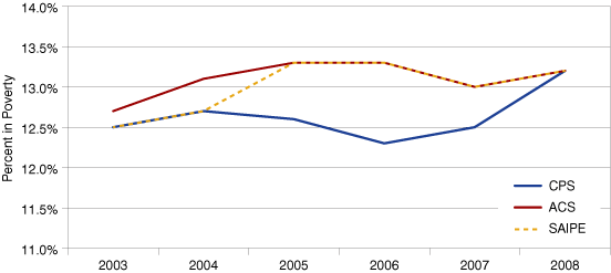
Source: IBRC, using U.S. Census Bureau data
Indiana continued to have a relatively low poverty rate from 2005-2008 when compared to its neighboring states of Kentucky, Illinois, Michigan and Ohio (see Figure 3).10 Using SAIPE data, Indiana’s poverty rate in 2008 was 12.9 percent, which made it the second lowest among neighboring states (Illinois had the lowest at 12.2 percent). Indiana consistently had the second lowest rate to Illinois over the 2005-2008 period.
Figure 3: Indiana’s Poverty Rate Compared to Neighboring States, 2005-2008
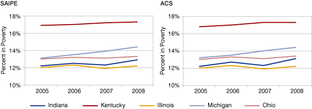
Source: IBRC, using U.S. Census Bureau data
Indiana had the second highest increase in poverty between 2005 and 2008, in part because it had such a low rate to begin with. Michigan had the largest increase. Using ACS data, a similar trend can be seen. Illinois still has the lowest poverty rate from 2005-2008, with Indiana a close second. Indiana also has the second largest increase in poverty, again second to Michigan. The small discrepancies between these two data sets in change over time can most likely be explained by the margin of error (see Figure 4).11
Figure 4: Change in Poverty Rate for Indiana and Neighboring States, 2005-2008
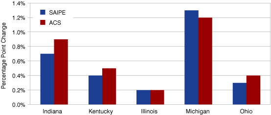
Source: IBRC, using U.S. Census Bureau data
Poverty Trend Among Indiana Counties
In the four-year time period from 2005-2008, 16 Indiana counties reduced their poverty rate, four counties showed no change, and 72 counties showed an increased poverty rate.12 Four counties (Delaware, Greene, Monroe and Daviess) showed a decrease of more than a percentage point. Seven counties (Madison, Switzerland, Gibson, Wayne, Morgan, Clinton and Vanderburgh) had an increase in poverty of more than 2.5 percentage points (see Figure 5).
Figure 5: Percentage Point Change in Poverty Rate in Indiana Counties, 2005-2008
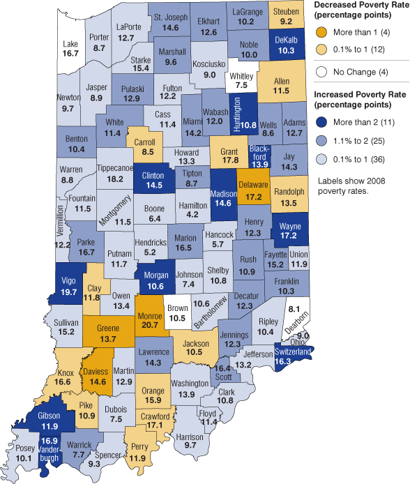
Source: IBRC, using U.S. Census Bureau data
The American Community Survey publishes poverty rates for Metropolitan Statistical Areas (MSAs). Looking at MSAs in Indiana, most (11 out of 16) showed an increase in poverty from 2005-2008, although in some areas it was much larger than others. The Bloomington MSA showed the largest decrease in poverty, at 3 percentage points, and the Evansville MSA showed the largest increase at 4.8 percentage points (see Figure 6).
Figure 6: Percentage Point Change in Poverty Rate in Indiana Metros, 2005-2008
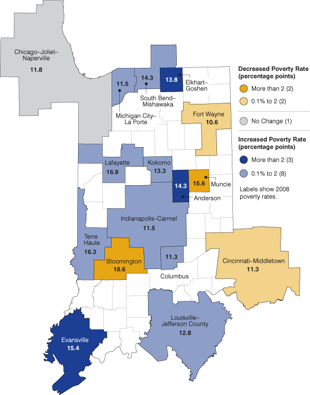
Source: IBRC, using U.S. Census Bureau data
A Concluding Caveat
The poverty estimates described here can be useful for general comparisons, but users should be cautious and read the footnotes carefully.13 Be aware that some questions on each of the surveys will change over time, especially for ACS, so it is best to look carefully at the comparison information provided on the ACS website before making conclusions about poverty data.14 Once again, reading introductory materials and footnotes should always be a must for the careful user of poverty data.
For more data on poverty, including a set of useful links for further research, visit STATS Indiana’s Poverty and Welfare topic page at www.stats.indiana.edu/topic/welfare.asp.
Notes
- See the Census Bureau website for the full list: www.census.gov/topics/income-poverty/poverty/guidance/data-sources.html.
- The poverty line was created in 1963 by Mollie Orshansky and is based on the economy food plan times three, which was the average percentage of the budget that people spent on food at that time. The economy food plan, while nutritionally adequate, was developed only for short-term or emergency use (https://www.fns.usda.gov/cnpp/usda-food-plans-cost-food-reports). Although the poverty threshold is the official measure of poverty in the United States, the Department of Health and Human Services Poverty Guidelines is a simplified version sometimes used to determine program eligibility.
- Most calculations of relative poverty consider earning below 50 percent of the median income to be poverty.
- In 2006, ACS began including group quarters in its data collection. Because people in households generally have higher incomes than those living in group quarters, the inclusion of group quarters may have lowered the per capita income in the ACS. The Census Bureau suggests making comparisons between 2006 and earlier years if the area does not have a substantial group quarters population.
- The Census Bureau advises against comparing SAIPE models that use the CPS annual supplement to those that use ACS.
- SIPP can be used to analyze the duration of poverty spells, or the nature of the spells, and changes in poverty on a monthly or quarterly basis. SIPP asks about income from up to 81 sources, so poverty rates are usually lower when using these data as compared to CPS.
- For a comparison chart with information on all of these data sources, see the Census Bureau’s website: https://www.census.gov/topics/income-poverty/poverty/guidance/data-sources.html.
- Data from the CPS annual supplement gathered from www.census.gov/programs-surveys/saipe.html
Data from ACS gathered from https://data.census.gov.
Data from SAIPE gathered from: www.census.gov/programs-surveys/saipe.html. - Looking at these data, one can see where SAIPE switched from using CPS data to ACS data.
- The years 2003 and 2004 were excluded because in 2005 SAIPE switched from using CPS to calculate poverty rates to ACS, which makes the data too different for comparisons.
- The margin of error ranges from +/- 0.2 percent to +/- 0.5 percent, depending on the year and the state.
- SAIPE data was used here because it is better than ACS for small counties.
- Correlation can be an issue as a result of ACS data being used to create SAIPE models and counties and states being correlated in the same year. For detailed information about comparisons with SAIPE data, both within years and with other sources of data, see www.census.gov/programs-surveys/saipe.html.
- A starting point for doing comparisons, with information on how to compare 2008 and 2007 ACS data is available at www.census.gov/programs-surveys/acs/guidance/comparing-acs-data.html/. Subsequent pages describe comparisons with early years of ACS data.
Jill Waity
Research Assistant, Indiana Business Research Center, Indiana University Kelley School of Business