Where From? Where To? Insights on Migration
Population growth and decline is a key measure of any area's vitality. The details of how such changes occur provide insights into the vitality of any area.
Two simple factors directly cause population growth or decline—natural increase and migration—and are described by demographers as the components of population change. The first is natural increase, which occurs when there are more births than deaths. Conversely, natural decrease occurs when there are more deaths than births. The majority of Indiana counties continue to experience natural increase, but there are 25 counties that have had natural decrease (more deaths than births) during the past seven years.
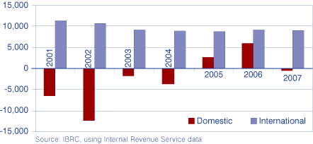
The second factor is migration—either into or out of an area. Migration figures are commonly shown as a net figure, the calculation of gross in-migration (people moving into an area) and gross out-migration (people moving out of that area). If net migration is positive, there are more people moving into an area than moving out. Since 2000, Indiana has experienced steady in-migration of people from other countries. During that same time, domestic migration (from other states in the nation) was a net-out between 2001 and 2004, with net-in occurring since 2005. That is, during the early years of the 2000s, more people from Indiana moved to other states than moved to Indiana, but we experienced a turnaround in 2005 and 2006, with more people from other states moving into Indiana (see Figure 1).
Figure 1: Indiana's Net Migration, 2001 to 2007

IRS Data Clue Us Into "Where"
For many of us, the most useful information shows us the specific localities to which our residents either come from or go to. To find out, we turn to information from, of all places, the Internal Revenue Service (IRS). Why? Well, they match addresses from year-to-year on our annual income tax returns, which then reveals our residence from one year to the next. While not perfect, it provides us with gross measures of migration for those who report income. We will use Marion County, Indiana's largest county and one of its most dynamic in terms of migration, as an example of using IRS data to reveal those specifics. First, some caveats:
- Based on federal income tax returns
- Not everyone files returns
- Roughly equivalent to "households" (returns) and "people" (exemptions)
- Use as trend, but don't try to equate to the previous census numbers (which utilize the IRS data as part of the estimation process)
- Data in this article are based on the latest IRS statistics available (tax year comparison of 2005 to 2006)
Marion County, with its population of nearly 900,000, is the largest county in the state and the 55th largest in the nation (out of 3,141 counties). It has nearly 400 square miles of land and a population density of 2,200 people per square miles, the most densely populated county in the state. As the largest county, it is no surprise that thousands of people move into and out of the county each year.
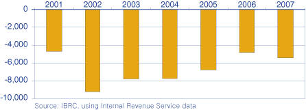
Since 2000, Marion County has experienced domestic out-migration, with more people moving out of the county than moving in (see Figure 2).
Figure 2: Marion County Domestic Migration, 2001 to 2007

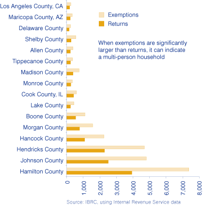
The majority of migrating Marion County income tax filers moved north to Hamilton County between 2005 and 2006, and this has also been the case for other years in this decade. Indeed, the majority of migrating people moving out of the county moved to surrounding counties, including Hancock, Hendricks, Johnson, Morgan and Boone counties (see Figure 3). Indeed, of migrations of hundreds or more, the only non-Indiana counties that Marion County folks migrated to were Cook County, Illinois (Chicago), Maricopa County, Arizona (Phoenix), and Los Angeles County, California (L.A.).
Figure 3: Moving from Marion to Other Counties, 2006 Tax Returns

Pick a County, Any County
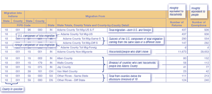
These data are available via STATS Indiana for all U.S. counties—as well as at the state level of aggregation—at www.stats.indiana.edu/topic/migration.asp (see the section labeled "IRS Nationwide Migration Flow Files"), so you'll be able to conduct similar analysis for whatever area interests you. For both the county-level and state-level data, there are two Excel files for each state—one measuring in-migration and one measuring out-migration; thus, you'll need both to calculate a net figure. Table 1 uses Adams County (due to its limited migration) to illustrate what the fields in the county-to-county migration inflow file mean as a way to help get you started.
Table 1: County-to-County Migration Inflow into Adams County, 2005 to 2006
 Click for larger image
Source: IBRC, using Internal Revenue Service data
Carol O. Rogers, Deputy Director
Indiana Business Research Center, Kelley School of Business, Indiana University
