The Older Generations in Indiana: A Demographic Look at Older Adults
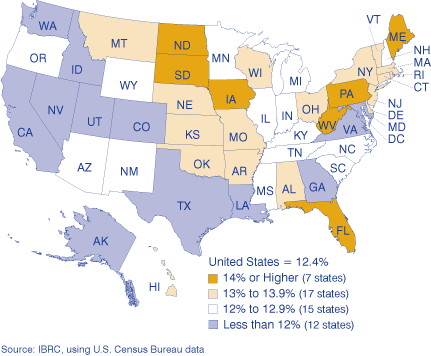
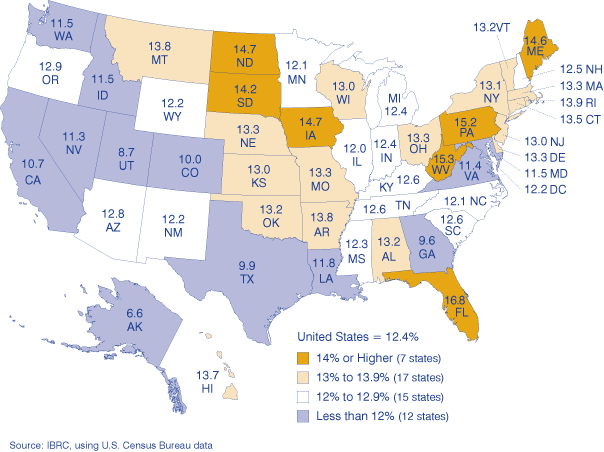
In 2005, there were about 36.8 million people living in the United States who were born before the invention of microwaves, spray cans or even cake mix. For the purposes of this article, we will identify this population (those 65 and older) as the elderly. They made up 12.4 percent of the U.S. population in 2005, a number that has remained steady since 2000. Florida led the United States in percent of population who are elderly, with 16.8 percent of the state's total population comprised of people 65 and older. Alaska was at the opposite end of the spectrum, reporting only 6.6 percent of its total population as elderly (see Figure 1).
Figure 1: Percent of State Population Age 65 and Older, 2005
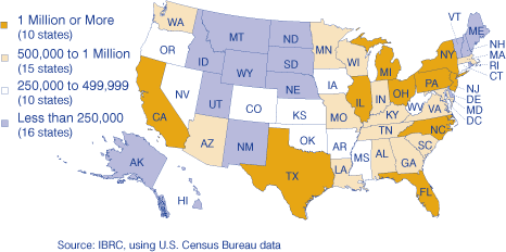
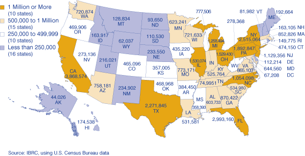
Click for larger imageWhile Florida had the highest percentage, California laid claim to the most elderly in the United States with about 3.9 million people in that category. Alaska was again at the opposite end, with just over 44,000 elderly residents (see Figure 2). So where did Indiana fall within the mix of things? Elderly Hoosiers were on par with the nation, making up 12.4 percent of the state with a total of 777,506 people age 65 or older in 2005.
Figure 2: Number of People Age 65 and Older, 2005
Indiana's Aging Population
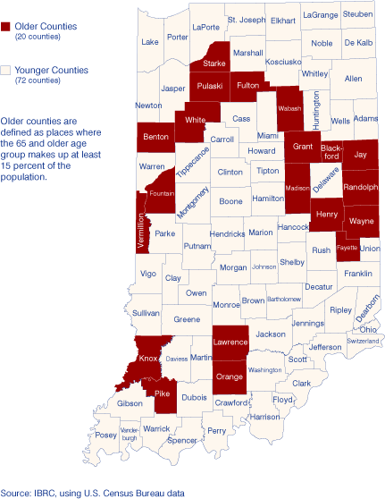
Twenty of Indiana's 92 counties had at least 10,000 elderly among their residents. Considering Marion County has the largest population, it is not surprising that it also has the most older residents—more than 94,000 in 2005. On a percentage basis, however, Wabash County had the highest proportion of elderly residents (16.6 percent). Five other counties had at least 16 percent of their populations age 65 or older, including Blackford, Fountain, Henry, Randolph and Wayne counties.
Let's take a closer look at those counties with a relatively high proportion of elderly. How do they compare to the younger counties in terms of labor force, jobs, wages and education? We will define older counties as those in which elderly residents make up at least 15 percent of the total population. Twenty counties meet that criteria (see Figure 3).
Figure 3: Indiana's Older Counties, 2005
Labor Force
These 20 older counties show an interesting but somewhat expected picture in terms of labor force. From 2000 to 2005, the labor force declined in older counties, down more than 8,100 people. Meanwhile, the population of the 65 and older age group increased over that period. This might be a telling bit of information if the younger counties showed opposite trends. However, the elderly population in younger counties grew 3.5 percent from 2000 to 2005, compared to only 0.9 percent in the older counties.
Industry Jobs
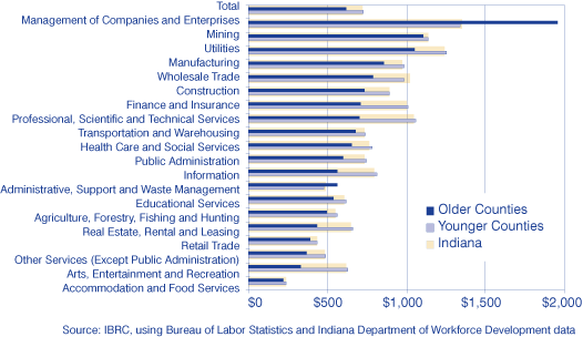
The 20 younger counties account for 8 percent of the total number of jobs in Indiana. Therefore, percent changes will likely be somewhat skewed by this smaller base, but should still give us an idea as to the directional trends. Since 2001, older counties have lost nearly 9,500 jobs for a 3.9 percent decrease. Younger counties, on the other hand, saw a 3 percent increase in jobs (see Table 1). Manufacturing and retail trade were the industries hit the hardest but they remained among the highest percent of jobs in both sets of counties. The health care and social services industry has added the most jobs in both sets of counties.
Table 1: Jobs in Indiana's Counties, 2001:4 to 2006:4
| Industry | Older Counties |
Younger Counties |
||||
| 2006:4 | Change | Percent Change | 2006:4 | Change | Percent Change | |
| Total | 234,905 | -9,486 | -3.9 | 2,614,635 | 74,953 | 3.0 |
| Management of Companies and Enterprises | 456 | 148 | 48.1 | 22,995 | 1,545 | 7.2 |
| Administrative, Support and Waste Management | 8,677 | 1,633 | 23.2 | 137,032 | 22,440 | 19.6 |
| Agriculture, Forestry, Fishing and Hunting | 2,140 | 341 | 19.0 | 8,603 | -42 | -0.5 |
| Transportation and Warehousing | 8,383 | 877 | 11.7 | 121,000 | 4,568 | 3.9 |
| Wholesale Trade | 6,928 | 584 | 9.2 | 104,807 | 907 | 0.9 |
| Health Care and Social Services | 34,604 | 2,561 | 8.0 | 315,838 | 30,580 | 10.7 |
| Accommodation and Food Services | 20,151 | 1,341 | 7.1 | 214,626 | 18,934 | 9.7 |
| Professional, Scientific and Technical Services | 3,474 | 177 | 5.4 | 84,218 | 6,754 | 8.7 |
| Educational Services | 22,961 | 720 | 3.2 | 226,151 | 18,981 | 9.2 |
| Construction | 8,720 | 178 | 2.1 | 139,337 | 4,243 | 3.1 |
| Arts, Entertainment and Recreation | 2,087 | -9 | -0.4 | 32,088 | -520 | -1.6 |
| Real Estate, Rental and Leasing | 2,061 | -27 | -1.3 | 34,219 | 1,262 | 3.8 |
| Public Administration | 13,215 | -408 | -3.0 | 114,178 | 7,036 | 6.6 |
| Finance and Insurance | 6,221 | -362 | -5.5 | 90,532 | -5,150 | -5.4 |
| Utilities | 759 | -65 | -7.9 | 12,357 | 565 | 4.8 |
| Retail Trade | 28,715 | -2,466 | -7.9 | 300,518 | -8,400 | -2.7 |
| Other Services (Except Public Administration) | 5,770 | -748 | -11.5 | 76,467 | 455 | 0.6 |
| Information | 3,394 | -470 | -12.2 | 41,680 | -3,801 | -8.4 |
| Manufacturing | 50,572 | -13,579 | -21.2 | 506,194 | -24,212 | -4.6 |
| Mining | 846 | -300 | -26.2 | 3,154 | -939 | -22.9 |
Source: IBRC, using Bureau of Labor Statistics and Indiana Department of Workforce Development data
Industry Wages
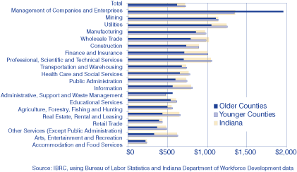
Wages in older counties dramatically lagged the younger counties and the state average overall. Average weekly wages across all industry sectors was $615 in the fourth quarter of 2006, an increase of only $60 in the past five years. At the same time, younger counties paid an average of $729 across industries per week, an increase of $91 over the same time span. As a state, Indiana paid $723 per week on average.
For the most part, younger counties hovered right around the state's average weekly wage across industry sectors. Meanwhile, older counties paid less in all but two of the 20 major industry sectors: management of companies and enterprises and administrative, support and waste management (see Figure 4). For both sets of counties, the management of companies and enterprises industry paid the highest average weekly wages in 2006 ($1,955 and $1,339, respectively).
Figure 4: Average Weekly Wages in Indiana's Older and Younger Counties, 2006:4
Conclusion
Counties with a higher proportion of older residents show definite differences in industry employment and wages when compared to counties with fewer elderly residents. Jobs declined and wages were lower for older counties from 2001 to 2006. However, as far as overall composition is concerned, industries showed similar patterns, with the same industries supplying the most jobs and the highest wages. Continuing to monitor these counties every few years could prove useful in determining how older populations affect the economy over time.
Molly Manns
Associate Editor, Indiana Business Research Center, Kelley School of Business, Indiana University