Looking at Hoosier Income in Real Terms
Indiana's personal income is one of the most closely watched statistics in the Hoosier state. Personal income includes the earning of workers and proprietors, including funds set aside in pre-tax pension, stock, or medical programs. Also included are rent, interest, and dividend receipts whether they show up in the mailbox or just accrue in an account. Finally, government transfer payments (for example: social security, welfare, and unemployment compensation) are added in.
This series is issued quarterly by the U.S. Department of Commerce (Bureau of Economic Analysis). State budget analysts use personal income numbers for their revenue forecasting efforts. Others convert these nominal data into real terms to examine the progress of the state's economy. Nominal or current dollars indicate amounts in terms of today's prices. Real or constant dollars attempt to represent consistent buying power over time. It is the best way to compare two periods in time by taking out the effect of inflation.
The conversion from nominal to real is usually done by using the U.S. personal consumption expenditure (PCE) deflator. There is no such figure for separate parts of the nation. An alternative adjusting number would be the consumer price index (CPI), but that is not as inclusive a measure as the PCE.
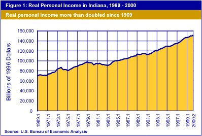
Over the years shown, Indiana's total real personal income has more than doubled, now exceeding $150 billion annually (see Figure 1). The compound annual rate of growth has been 2.5%. This number is computed to yield a constant growth rate that would move smoothly from the starting point of the series up to the last value reported.
But, as is apparent in the data, the path has not been without bumps. In Figure 2, the quarterly growth rates (seasonally adjusted at annual rates) are shown. These rates are based on the change from quarter to quarter after the data have modified to represent the seasonal patterns that occur in the economy. They are raised to the fourth power (compounded for a year, just as an interest rate might be at a bank). This process keeps us working with annual numbers, but also gives added drama to the ups and downs in Figure 2.
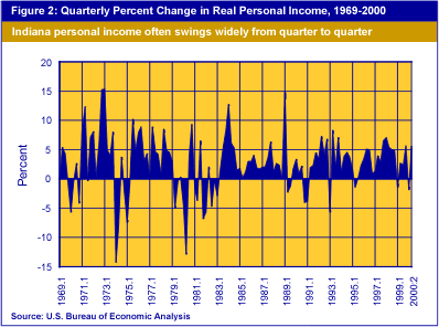
The average (mean) growth rate for Indiana's real personal income was 2.61%. This represents all the diverse rates shown in Figure 2 (and is higher than the smoothing, compound annual rate of 2.5% discussed earlier).
As seen in Figure 2, the record of growth is very uneven. The economy does not follow a smooth path. However, some of these wilder fluctuations are caused by unusual factors. For example, federal government subsidy payments to farms can be very high in one quarter and disappear in the next. Likewise, workers and executives may receive bonuses in one quarter, and then income falls back to "normal" thereafter. These two factors can result in a huge advance being followed by an equally dramatic decline. Seasonal adjustment factors may not catch these elements, but seasoned analysts should not be deceived by the data.
The data in Figure 2 can be summarized in a frequency distribution or a histogram as shown in Figure 3. Here we find the mean or average growth rate of 2.61% falls almost in the middle of the modal group, that grouping of growth rates between 0.1% and 5.0%. The modal group is the one with the most observations. In this case, 61 of the 125 quarters between 1969:1 and 2000:2 fall in that group. The other categories fill out the chart with a fairly nice normal, bell-shaped pattern. (When a series of numbers has one or more very extreme values, the mean may not fall in the modal group.)
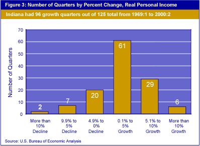
There were 29 quarters during which Indiana had declining real total personal income and 96 in which real total personal income grew. Which sectors contributed to these declines? Figure 4 offers the number of declining quarters of earnings for the major nonfarm sectors of Indiana's economy.
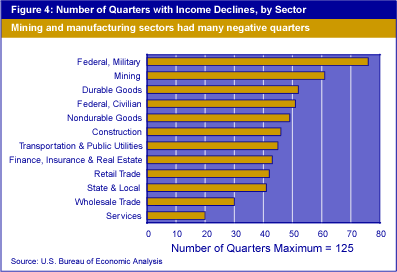
Although relatively small in the state's economy—just 0.2% in 2000:2—the federal military has shown the most negative role, with 76 down quarters in the 125 quarters of our study. Durable goods manufacturing, accounting for 14.6% of personal income, gave us 52 down quarters, while services, now 15.9% of the total, had but 20 down quarters.
With all this up and down movement, how tightly packed are Indiana's real total personal income growth rates around the mean? That is not an idle statistical question. In effect, we are asking, "How volatile is the Indiana economy?"
The usual measure of dispersion or scatter is the standard deviation, which indicates whether a series of numbers is very tightly clustered (a low standard deviation) or widely dispersed (a high standard deviation). The standard deviation is calculated based on the difference between each observation and the mean. But the standard deviation alone cannot tell the story. For example, if the standard deviation is 3 and the mean is 10, we can expect to find 68% of the observations between 7 and 13. That is pretty widespread, compared to a standard deviation of 3 and a mean of 100, where 68% of all observations would be between 97 and 103.
Therefore, it is the ratio of the standard deviation to the mean that is of importance to answer our volatility question. This value is called the coefficient of variation. In Figure 5, we see the mean growth rate, the standard deviation and an indicator of the coefficient of variation for the five sectors that account for 50% of Indiana's total personal income.
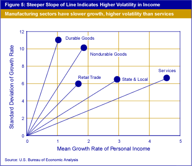
Durable goods manufacturing has been the slowest growing sector with a mean growth rate just over 1% per year. However, durable goods also have the highest standard deviation. That combination gives them also the highest coefficient of variation among these sectors. The coefficient of variation can be read somewhat like a clock. The more vertical the line from the origin to the sector's point on the chart, the higher the coefficient (about 11 in the case of durable goods).
The flattest line is in services, where the growth rate is about 4.5% and the standard deviation is less than 7%. This yields a coefficient of variation close to 1.5, which is the lowest of those shown. In effect, the most volatile sectors of the big contributors to the Hoosier economy are the manufacturing sectors. Retail trade, state and local government, and services, in that order, have lesser amounts of volatility.
These notes have explained some of the most common measures used to describe economic statistics. Exact calculations have not been described, but it is hoped that these notes offer some clarification for readers of IN Context. Questions about these and other data should be directed to the Indiana Business Research Center and the Indiana Department of Commerce
